Review the following sample resume headers for ideas on how to combine information. Pay special attention to the suggestions that include the same number of data fields as you plan to use in your heading.
It is important to always include a ruling line under your contact information because it pulls the reader’s focus to the text at the visual center of the page. You’ll see what we mean if, after you complete your resume, you print one version with a ruling line and one without. The one with the line is discernibly more organized, orderly, and focused. You can experiment with the Borders and Shading feature in Word or the Graphic/Custom Line keys in WordPerfect for variations on ruling lines.
Table of Contents
Resume Header Examples by data fields
You’ll see tips on arranging as many as eight data fields while concurrently keeping the visual focus on your name and squeezing out as much white space as possible.
Three data fields
With e-mail addresses as commonplace as telephone numbers, it will be unusual for you to have only Three Fields of contact info. For those without an e-mail address, the following example is a classic, traditional heading style.
Your name should be one of the focal points on your resume. In paper resumes, your name traditionally appears above any other information.
Note that you don’t need to include the word residence or home in front of the telephone number. It’s assumed that this is a residential number when you list it below a street address. While I’m on the subject of telephone numbers, be certain to avoid the easy-to-make mistake of forgetting to include your telephone number.
Four data fields
If you have an equal number of pieces of information that make up your contact data, consider “splitting” this information on the left and right margins. The following is an example.

In this header, the equal number of data fields is four:
- Street address
- City and state
- E-mail address
- Home telephone
By arranging this information on just two lines, you gain another line or two of precious space in the body of the resume. Another benefit is that your name clearly stands out because of the extra white space you’ve created.
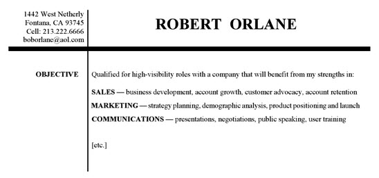
Here’s a header example with a bit more personality. The vertical line extends the length of the page on the actual resume.

The ruling line style in the next example is also popular; it’s simple, yet striking.

Note in the following example how the size of Robert’s name is increased because of its positioning on the left margin. This was done because the name will be difficult to see if his resume is in a stack of papers held together by a paper clip at the top-left corner. If your name is short. Instead, position your name in the center; otherwise you run the risk of being “invisible” when the interviewer flips through a pile of resumes.
The following example uses a text box for the candidate’s monogram: The dressier heading suited his career in broadcast sales.

The next example is a bold, four-bit version with ruling lines above and below.

Five data fields
If you want to add a fifth piece of information, such as an online portfolio, center it between the city-state and home telephone number, as in the following header. It is not always necessary to include the word e-mail (or email) in front of your electronic address. In cases where this word appears, it was done to add visual balance to the header.
Six data fields
The following example lists six pieces of contact data. The placement of the information on the left and right margins was determined from a design perspective rather than a content perspective. Note how each line of information on the left margin is relatively balanced by its counterpart on the right margin. There is a pyramid effect, with Robert’s name forming the peak. Some pieces of information could have been swapped. Again, we chose this arrangement because it creates a good visual design.

Try different arrangements of your “data fields”. Your goals in doing this are to keep the visual focus on your name, create an eye-appealing design, and maximize white space.
Seven data fields
Of the seven pieces of contact data in the following header, your eye is probably drawn to the URL for the candidate’s Web resume because it has more white space around it.

Eight data fields
This is the greatest amount of contact information you should consider putting on your resume. It pushes the limits. Anything more will detract from your name.

If relocation is not part of your plan, skip ahead a few pages to the section titled “Objective, or Focus Statement”.