Dozens of typefaces, or resume fonts, come as standard features in popular word-processing programs. Beyond these, you can purchase additional fonts on disk or download them from various sources.
Table of Contents
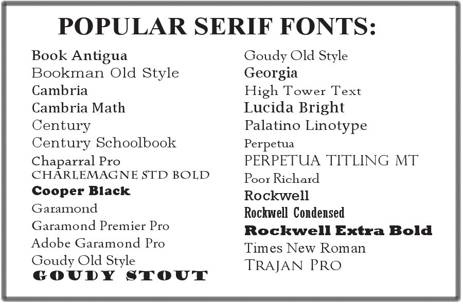
Professional fonts for resume
The professional resume fonts come in two flavors: serif and sans serif. Serif fonts have fine lines that finish off the main strokes of the letters, sometimes called “feet”. Serif fonts dress up documents with a more traditional, formal look. Sans serif fonts do not have feet and produce a simple, clean look. The following images shows some of the most popular serif and sans serif fonts.

Point size for resume font

Resume font size is a measurement device that refers to the height of each character. There are 72 points per inch. The point size for resume font can range from 9 points to 12 points. Your name can be a few point sizes larger than the rest of the text, especially if it is a “short” name that needs help standing out.
Choosing a Resume Font
Your choice of resume font is an important decision because the font plays a major role in your resume personality. In general, the more senior the position you seek, the more traditional the font selection should be. Font selection also goes hand in hand with layout/pattern. If you’ve chosen an unusual layout, you might want to pair it with a more decorative font. For instance, Lucida Calligraphy might be appropriate for an artist whose resume is list-oriented and light on copy. Comic Sans, which gives the appearance of a child’s handwriting, might be appropriate for a kindergarten teacher’s resume.
Spacious Professional fonts for resume
Although each sample in the preceding table is printed in the same size, you will note that some take up less space than others. Resumes that are rich in text might benefit from a type of condensed font to maximize space. If you have difficulty making copy fit on your page, dabble with the point size, taking it down 5 to 2 points in size. If this compromises readability, revert to a skinnier font.

When you’re preparing a scannable resume, beware of using a font that’s too tightly packed, where letters touch each other, because it will distort during the scanning process. This is especially true for serif fonts. Later in this chapter are tips for expanding character spacing; also refer to chapter 9 for tips on preparing a scannable resume.
Use Discretion in Mixing Fonts
You can avoid design bloat by limiting your selection of fonts to two. In many cases, one is plenty. If you choose to introduce a second font, save it as an accent for headings or your name instead of mixing it haphazardly within the body copy. Reserve the more decorative fonts (such as Harrington or Bodoni) or bold fonts (such as Clarendon Condensed or Albertus) for category headings. A full page of any of these is too heavy, much like dining on chocolate decadence dessert for breakfast, lunch, and dinner.
Go Easy on Bold, Underline, and Italic
The admonition about not mixing too many fonts also holds true for using bold, underline, and italic. Go easy! Reserve bold treatment for your name, category headings, company names, or titles. On occasion, it might be appropriate to add bold to highlight a few, select portions of text.
Think twice before using underlining. Rarely will you use it for anything other than company names or position titles, and you shouldn’t use it for both of those. As with boldfacing, on some occasions you might want to underline important text to help draw the reader’s eyes to juicy information, just as the next example does.
An italic font is appropriate for book titles, foreign words, and quoted passages. With prudent judgment, you can also sprinkle an italic font sparingly in a portion of a sentence or perhaps a whole sentence—but never entire segments, such as all of the impact statements.